Covering the Book - What Do You Think?
I'm tripping out on book covers, now that I'm paying attention to my own.
There's so much to it!
You want it to say hello to the world, to invite readers—to compel them—to pick up your book.
And buy it.
It has to reflect what's inside.
It has to tease.
And it has to look good.
Since I'm not a designer, it's perplexing to seek the path from my ideas
to the graphic execution that syncs up with my ideal.
Here's another twist: I don't need a book cover yet.
I just need a manuscript cover as I send my book out to publishers.
I need my manuscript cover to compel publishers to take a chance with my book,
to convey my seriousness and talent and the value of my art.
So about a week ago, I put out the word to a few designers and artists I know asking for their tries. Below are covers from three different people: Mark Bell, Ray Massie and I.
Please share your thoughts with me in the comments section or at Facebook.
I'd like to know what grabs you.
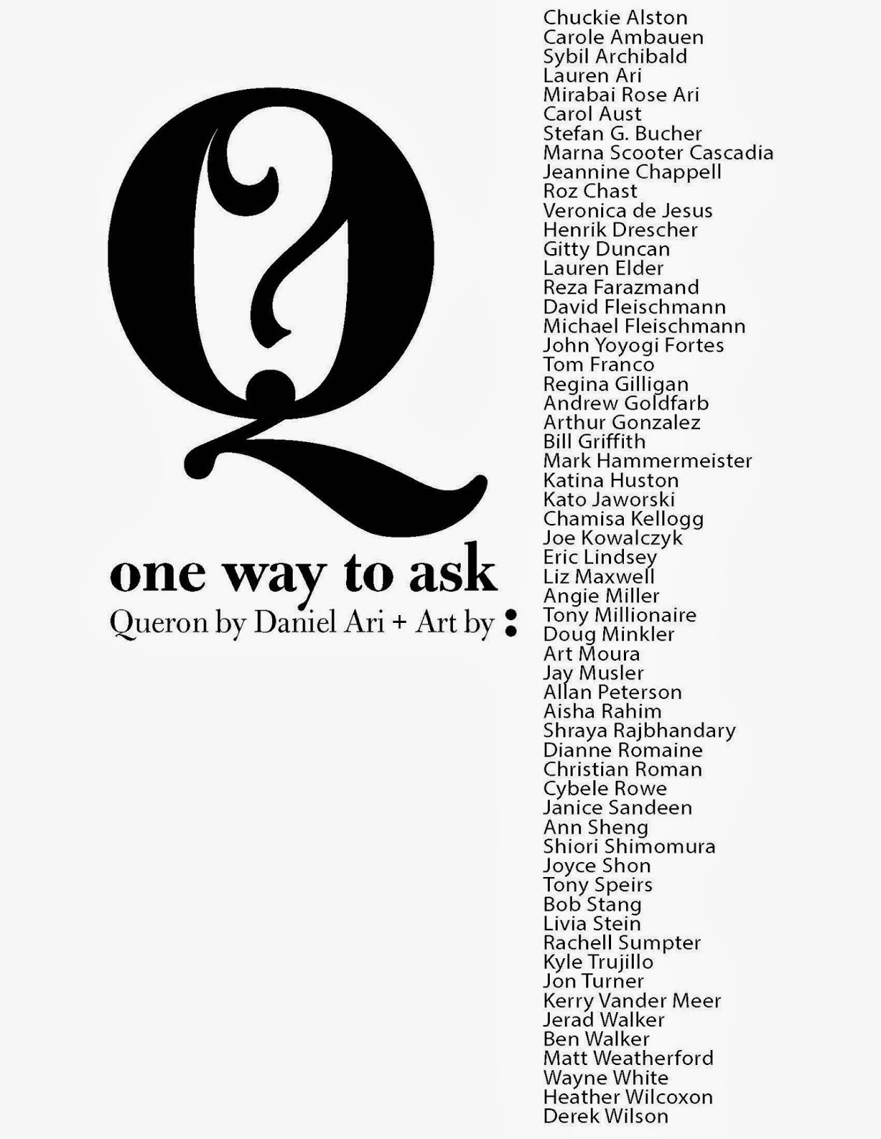 |
Default working version |
 |
Word cloud version |
 |
Rotation type treatment |
 |
Graphic wheel version (harkens to City Lights book covers) |
 |
Traffic sign |
 |
Pear version |


Dan,
ReplyDeleteI prefer the first one. It's an enticing graphic conveying the artistry of words and letters. It gives an impression that something really interesting is behind the cover. If I saw that on a shelf I'd pick it up to look. I love that "Queron" is such a prominent part of the design. Plus I'd have no idea (if I didn't know you) what they were, which would also pique my curiosity. It's simple, clean, and precise which echoes the craft of your writing. The second one is too busy. The third one is too hard to read. The fourth one reminded me too much of Coney Island of the Mind. (Your poetry is nothing like Ferlinghetti.) The fifth one reminded me of driving, which I do way too much of. The sixth one confused me. I didn't know what the pear had to do with the content. I hope you can excuse my bluntness, but I know how important the cover art is, so I wanted to be completely honest and clear. This piece of art deserves to be treated with great deliberation and care. You have created something truly special. It will be the first piece of literature I'll wish to review on my blog. (Don't worry, I'll treat it with utter respect. :-) ) All my love and best wishes for your project, Dan.
I LOVE the rotation type treatment, and the One Way sign. Cleaner, less busy, but still honoring the artists. CONGRATULATIONS! And be sure to let us know when the book is available!
ReplyDeletede
This comment has been removed by the author.
ReplyDeleteI like the first one...the focus is on the question mark which I believe conveys the essence of the title. I'm not sure why you want to list all of the illustrators on the cover...though I like how they hang together visually and in balance on this cover.
ReplyDeleteDaniel, the one way traffic sign appeals to me with its simplicity and visual familiarity. Small print used for names does not distract from the "one". Best with book!
ReplyDeleteThank you everyone! Your input is hugely helpful to me.
ReplyDelete